Jiuup
- Web app
- Full-stack development
- UI/UX design
- Realtime chat
Meet & connect with friends everywhere.
- Role
- Founder & lead developer
- Timeline
- March 2026 to present
- Team
- Brian Chan, Founder, lead developer, UI/UX design
- Brian Wu, Algorithm tuning
- Jeannie Tsai, Colour & UI design, print collateral, character design
- Carlos Lu, Planning & on-campus promotion
- Emily Chang, Marketing, promotion & planning
- Flora Huang, Branding, marketing, back-office design & data analysis
- Built with
- Next.js, TypeScript, Supabase, Capacitor, Tailwind
It all came from a conversation with a classmate.
“There are so many people at this school,” he said, “so why does everyone still seem lonely? And the things I’m into always feel too niche. I can never find anyone to do them with.”
The problem
Most people on a campus want to go out more than they do. A small survey we ran with 25 students pointed this way, and research says the same. People expect others to be less interested in connecting than they really are (Epley and Schroeder, 2014), and they underestimate how much a message from them would be appreciated (Liu et al., 2022). What stops them is the cost of being the one who asks. People often don’t want to be the one to pick the people, send the message, and carry the risk of being rejected.
How to let people find each other?

Our solution
We built a way to take the cost out of asking. Asking one person means choosing who to ask and then hearing their answer. A post is open to anyone who is interested, so nobody has to be picked and nobody has to say no. People who don’t feel like going simply scroll past. Anyone can post an activity, tag it, and say what it needs. You can also join one that somebody else has posted. After that the hangout has its own room, where you meet the people in it, talk, work out the details, and then go and do the thing in person.
Jiu is the Mandarin reading of 揪, which means to get people together. Up expresses a feeling of speed and success. So we named it Jiuup, pronounced jiu-up.
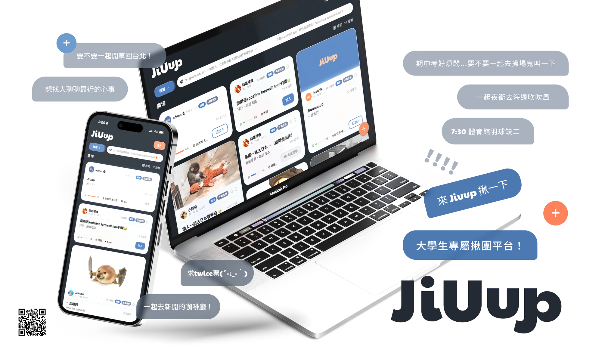
Jiuup is a campus platform where students post activities, meet people who like the same things, and keep talking until they meet in person.
Why it is shaped like this. You can browse the feed without an account, and we only ask you to sign in when you want to join or post. This way a post can be shared as a normal link and anyone can read it. Posting and joining both lead to the same chat room, so we only had to build one room and make it good.
UI design
We wanted Jiuup to feel bold and lively. The goal I cared about most was legibility, with strong contrast that still feels soft on the eyes.
We used Figma to brainstorm and to try out layouts and colours with our designer. We started from a plain skeleton of the feed.
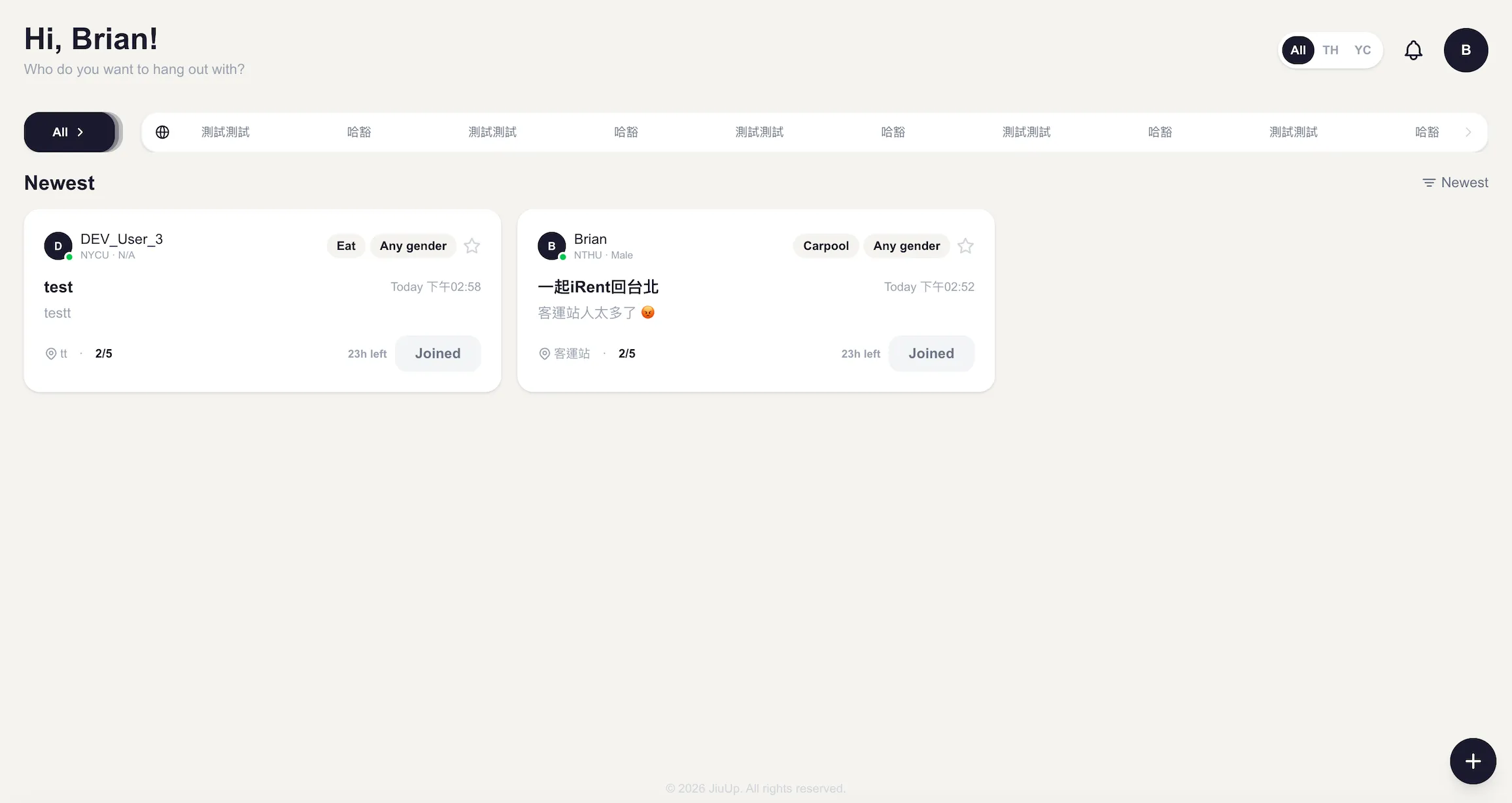
In the middle of the project the design kept getting heavier. We had not tested it with users yet, but we could tell we were drifting away from the problem we wanted to solve. So we decided to simplify. We put more of our effort into how smooth the software feels and into the UX itself, such as the flow and the transitions between screens. For the UI we kept only what was needed and spent our time on colour and on making it easy on the eyes. The categories are a good example. We considered parent and child categories and chose one flat row of fourteen, so one tap filters the feed.
Mark, colour, a post

- Ground#202830
- Blue#4D6F9A
- Orange#CC7456
- Glass#CED0D1
- Online#7BDC74
Why these numbers. The card is frosted glass on a dark background, so we calculated the contrast on the real colour of the glass. Every button is at least 44 high, the smallest size a thumb can hit reliably. The blur is 12 because 24 made Chrome drop frames when scrolling.
The feed and the room
Why the layout. A post with a picture is exactly as tall as two normal posts plus the gap, so the columns always line up. In the chat room only the conversation stretches, and on narrow screens the side panels turn into sheets.
Architecture design
For the backend we first considered services from Cloudflare and Google. At that time we wanted to validate the product quickly and iterate fast, so we chose Supabase. It was quick to build with, its database is standard SQL that we can migrate later, and its realtime feature is well optimised for chat.
- BrowserAny phone or desktop
- Installed PWAService worker with a cached shell and Web Push
- PagesThe first screen of the feed is rendered on the server and the rest hydrates
- State and cacheUser context, SWR and localStorage, with optimistic updates
- Feed rankingEvery post is scored on the device, per person
- Shield layerEvery request goes through cache, breaker, dedupe, queue and retry
- Realtime providerOne interface for live data, so the transport can be swapped
- MiddlewareChecks the session on protected routes and the role on admin routes
- API routesInvite codes, reminders, push sign-up, HEIC conversion, share images
- Scheduled jobsDaily clean-up of old posts, metric snapshots, reminders and re-engagement
- Rate limiterUpstash Redis, with a memory fallback
- Admin and adsRetention and click-through for the team, and a results link for each advertiser
- AuthGoogle, Apple and LINE, over PKCE
- Postgres29 tables, functions for polls and invite codes, triggers for seat counts
- RealtimeMessages, members, read state, presence and typing
- StorageAvatars, post pictures, chat images and files
- Push functionA database webhook on each notification, sent out as a push
Why it is wired this way. The app reads and writes to the database directly, so most requests do not pass through our server. This makes every query faster and gives us live updates without running our own socket server. We only use the server for things that need a secret key, such as scheduled jobs and push notifications. Realtime is wrapped in one interface so we can replace the provider later without changing any screen.
Shield layer and security
Why they exist. There is no backend of our own between the app and the database, so two jobs that a backend normally does had to go somewhere else. The first is protecting the user from a slow or failed query. When many identical requests arrive together the shield layer only sends one. When a service keeps failing it stops calling it for a while and shows the last good data. It also retries at random intervals so that all clients do not reconnect at the same moment. The second is protecting the data. The app talks to Postgres with a public key, so checks in the interface alone are not enough. Each table has its own rules for who can read and write a row, and the limits on posting and messaging are written in the same rules because these inserts never go through our API.
Feed ranking
- Popularity
- Joins × 3 plus clicks, divided by (hours + 2) to the power 1.5
- Freshness
- Falls in a straight line over five days
- Fit
- Activity type 35, distance 25, age 15, familiar place 12.5, time of day 12.5
- One slot in five is held for posts under six hours old.
- A join counts 3, a save 2, a click 1, and each fades over thirty days.
- With fewer than five interactions, fit falls back to distance, age, how full a post is, and chance.
Why it runs on the device. We do not need to run or pay for a ranking server, and changing the sort order is instant. We keep one slot in five for new posts so a hangout posted a minute ago can be seen before anyone has joined it. This matters a lot on a small campus. The small random value is seeded by the post, so the order stays the same when the page renders again.
Business
Jiuup also has an admin console. The teammate in charge of analysis uses it to track retention and click-through rates and shares the findings with the team, so we can decide together what to change next.
We also designed a way to earn revenue. After signing a contract with a local business, we can publish its ad on the platform. During the promotion period the business gets its own link where it can see the performance, the conversion rate and the analysis of its ad.
Challenges
We met many challenges along the way. Two of them shaped the project the most.
Cold start
A hangout platform is empty until many people join at the same time. At first we discussed common ways to promote it, such as paid ads and social media posts. Then we realised that if we could not reach many students at once, the cycle of posting, joining and chatting would never start.
So we chose the most direct ways to reach a large group of students. We worked with student clubs, and they used Jiuup for lucky draws and announcements at their events. This also helped the clubs, because they no longer needed to create another group chat just to make announcements. We also handed out flyers ourselves at the busiest places on campus.
Choosing the platform
My first idea was simple. I wanted the fastest way for everyone to access the platform, with no download and no extra steps. That is why we chose a web app, which also made development faster. Web push notifications seemed mature enough at the time, so I thought message notifications would not be a problem. People who wanted an app experience could install the PWA. We wrote an install guide and optimised the installed version for phones.
Later we found that installing a PWA is simple, but it is not the way people are used to getting an app. Many users kept using the browser. Because of the limits of web notifications in the browser, they often did not receive new messages after a chat started. This was the most direct reason the experience got worse. It was also the main reason many users left after the first wave of excitement.
We wanted to build iOS and Android versions, but we had to put that plan on hold because of the development cost and our limited team. We did not overcome this challenge. It taught me to think about how users will come back before I decide how they get in.
Summary
Jiuup started from one conversation with a classmate. We turned it into a product, ran it with real students for about six months, and kept changing it based on what we saw. The design became simpler once we returned to the problem we set out to solve. The architecture stayed small so that we could move fast. Working with clubs helped us get through the cold start. The platform choice is the part we could not fix in time, and it showed me how important it is for users to be able to come back. I will take these lessons into what I build next.