 Snapy
- iOS app
- Swift
- UI/UX design
- On-device face detection
- Camera and photo editing
Snap any time, anywhere.
- Role
- iOS developer and UI/UX designer
- Team
- Brian Chan, Concept, user research, UX flow, UI and interaction design, full-stack iOS development
- Jeannie Tsai, Concept, user research, brand identity, UI/UX design and service blueprint
- Built with
- Swift, SwiftUI, Vision, Core Image, Metal
In 2024 I kept seeing queues outside photo booths in Taiwan, and one question stayed with me.
Why can’t taking a photo on a phone feel like an occasion too?
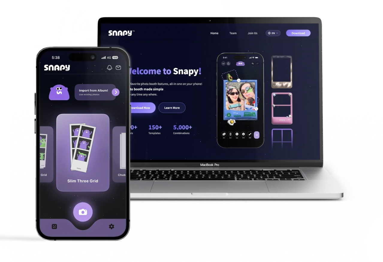
 Your Pocket PhotoboothDownload on the App Store
Why photo booths
Since 2020 photo booths have become one of the main ways young people make and share memories, and by 2024 they were everywhere. Wherever I went there were young people lining up to use one. I tried it a few times myself, and I think I understood what people liked. We take photos on our phones all day, and taking one no longer feels like anything. A booth gives that feeling back.
I asked Jeannie, who studies design at National Taiwan Normal University, what she thought, because I wanted to hear it from a woman’s side. That conversation showed me what I had missed. Phones already have a camera app for every purpose. A booth is different because each photo can only be taken once, and the print comes out right after. That is the part people cannot get anywhere else, and it is why booths are so hard to replace.
We also asked people who use booths why they go. Most of the reasons were about other people. Sharing the photos online and making memories with friends came first. A look that feels personal and a print to collect came after.
Why young people use photo booths
- Sharing and posting on social media38%
- Making memories with friends32%
- A look that feels personal20%
- Collecting the printed photos10%
What a visit is like
Jeannie then mapped a visit to a booth for two users, in twelve steps from meeting up to the days after. The mood drops in the same places for both of them.
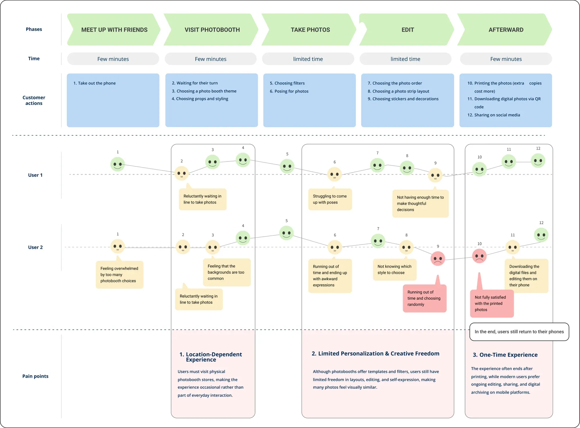
The map ends in three limits.
- A booth depends on a place. You have to go to where it is and wait in line, so it stays an occasional thing.
- There is little room to make it yours. There are templates and filters, but you choose in a hurry while the time runs out, and many strips end up looking alike.
- It happens once. When the print comes out the experience is over, and people still go back to their phones to edit, keep and share the photos.
That left us with two questions. Could taking a photo on a phone feel like an occasion again? And could a booth be something you keep using, on the phone where the photos end up anyway?
The idea
I invited Jeannie to build it with me. We wanted to put the convenience of a phone together with the occasion of a booth, and to let the experience go on after the photo is taken. We called it Your Pocket Photobooth.
Snapy is a photo booth for iPhone. You choose a layout, the camera counts down and takes the shots by itself, you decorate the strip, and it goes onto your wall.
Each part of the app answers one of the three limits. The camera is with you anywhere. The editor gives you room to make a strip your own. The wall keeps every strip, so the experience goes on after the first one.
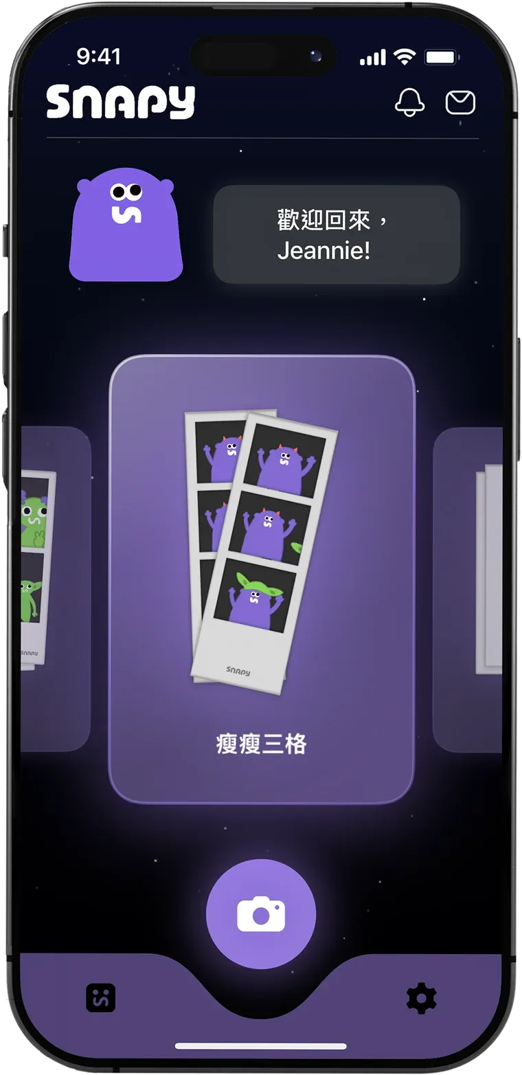
CameraA booth that is with you anywhere, with no line to wait in.
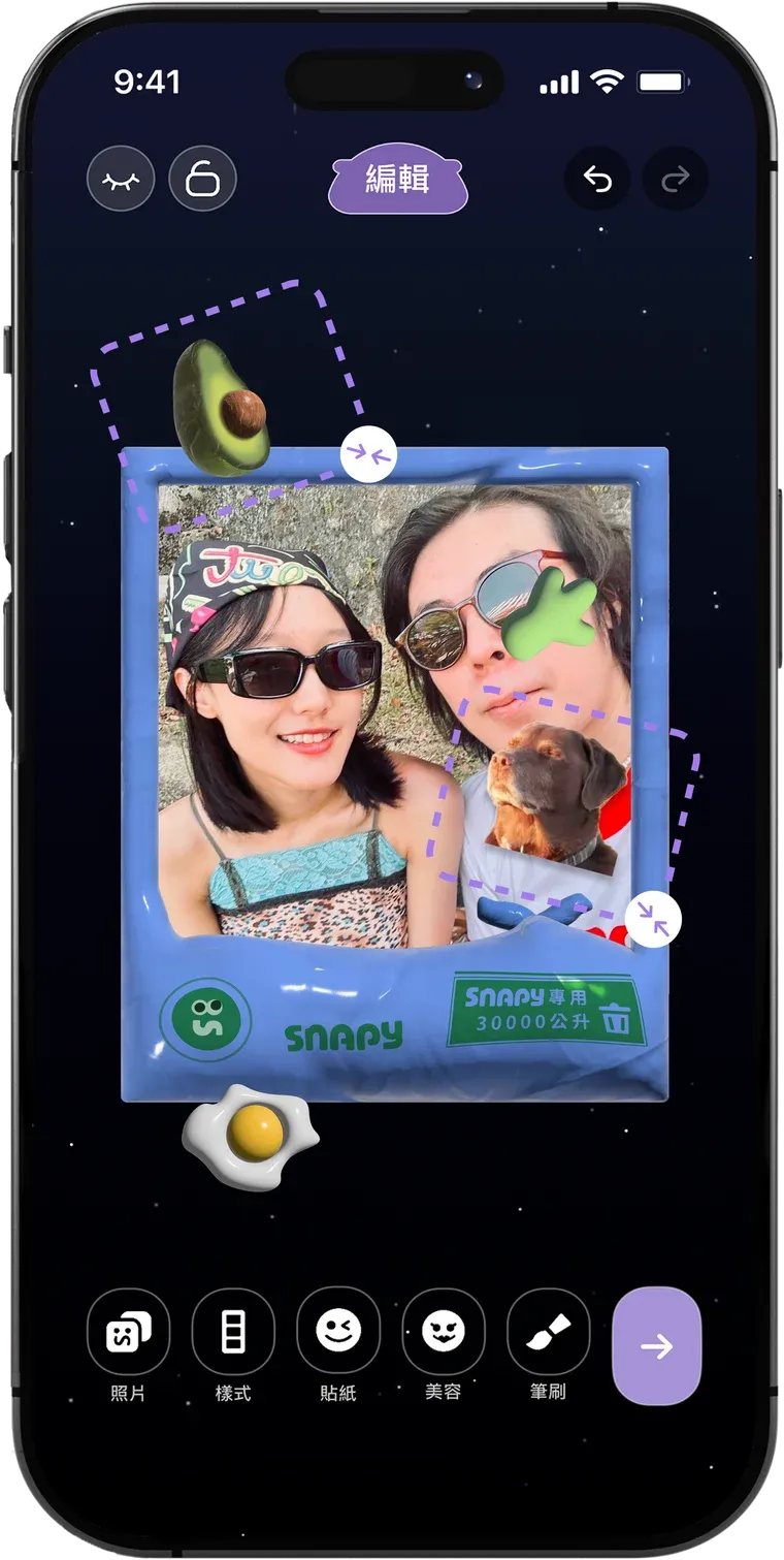
EditorThemes, stickers, brushes and beauty for a strip of your own.
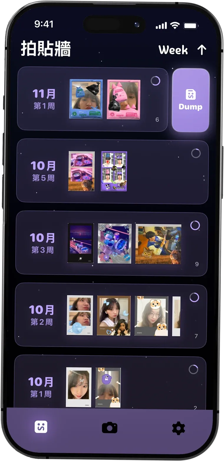
Wall and DumpEvery strip is kept by week and can be shared at any time.
A visit to a booth ends at the printer. With Snapy it becomes a loop. You meet up, take the photos, make the strip your own, keep it on the wall and come back to it later.
Who it is for
We designed Snapy for people from 15 to 25, and Jeannie wrote two personas so we could keep them in mind.
Mia, 22
Collects memories with friends
A university student who loves taking photos with her friends. She wants to capture a moment quickly and share something that looks like her own.
With Snapy She makes a strip on her phone with templates and editing, and shares it right away.
Ethan, 19
Wants to express his own style
A design student who likes Y2K visuals and editing photos. He wants a lot of creative freedom and a place to keep what he makes.
With Snapy He builds his own layouts and templates, and the wall becomes a record of his style over time.
Who did what
We worked out the concept together, and we both did user research and UI/UX design. I designed the user flow and the interactions, and I did the full-stack development of the iOS app. Jeannie created the brand identity, which covers the logo, the colours, the characters and the visual content inside the app, and she drew the service blueprint.
We built the design around three things, which are the flow, the feeling of occasion and the look.
The flow
We wanted anyone to know how to use Snapy the moment they opened it, and to get through it every time without having to think.
The app opens on the camera tab. The layouts are a row of cards you swipe through, and there is one large button under them. Pressing it takes you to the filters, and one more press starts the camera. From there the phone does the work. It counts down and takes each shot by itself, the way a booth does. The countdown can be 10, 15 or 20 seconds. If you do not want the pressure of a clock, you can turn it off in the settings and press the shutter yourself whenever you are ready. Snapy takes two more shots than the layout needs and you pick the ones you keep. There is no retake button.
The camera button
The camera button was the hardest part of the home screen. It is a ball that floats above the tab bar, and the top edge of the bar dips to make room for it. When you go to another tab the ball comes down and the edge closes flat. When you come back it rises again.
Drawing that dip was the problem. The edge has to bend down and come back up as one soft line, and it has to stay soft at every moment while it is opening and closing. I tried to get there by changing numbers until it looked right, and I could not.
So I found an e-book on how curves are calculated and read it. I learned that a Bézier curve leaves each of its points in the direction of that point’s handle. The dip is two curves that mirror each other. It only looks like one line when the handles are level at the three points where the curves start, meet and end. After that the shape came down to four handles and one number.
The number runs from 0 to 1. At 0 the bar is flat and at 1 the dip is fully open. The width and depth of the dip, the height of the bar, the lift of the ball and the size of the icon all read from it, and one spring moves it. Since everything follows the same number, the ball and the bar always move together.
On the curveHandleProgress
The feeling of occasion
The second thing was the occasion itself. We wanted it to be there before the photo, while it is taken, and after.
Before the photo you choose from ten layouts and ten filters, and the filter is already on the picture in the viewfinder. You can also build your own template with your own colours, textures, pictures and text.
After the last shot the strip does not simply appear. It comes down from the top of the screen a little at a time, and the phone ticks in your hand with each step, the way a print comes out of a booth.
Then it goes onto your wall, where the strips are kept by week. At the end of a week you can turn that week into one picture, which we call a Dump, and share it. There are stickers, brushes and frames to collect and use, and you can make stickers out of your own photos. On a phone you can also take as many strips as you like, share them, and keep all of them in the app.
The editor is where a strip becomes yours. There are 206 ready-made themes and 266 stickers, which already gives more than 5,000 ways to dress a strip before you choose a filter or pick up a brush.
Beauty for each person
We also wanted to use what a phone is good at, and we started from the booth’s biggest weakness. We asked about fifteen friends, and what bothered them most was the group photo. When several people are in a shot, it is hard to look after everyone. Most of the group looks good in one photo, one person is unhappy with how they came out, and they go along with it for everyone else.
A phone can tell the faces apart. Snapy finds every face in the strip and works out which faces across the frames belong to the same person. Each person then has their own settings. One friend can smooth their skin while another leaves theirs alone, in the same picture. If the app puts a face with the wrong person, you tap that face to move it.
There are six effects and every one starts at zero, so nothing changes until you move a slider yourself. None of them changes the shape of a face.
On the phone, in this order
- SwiftUIDraws the screen, the sheet and its drag gestures.
- VisionFinds every face in the strip and the landmarks on it.
- Our own face matchingDescribes each face with 128 numbers and compares them across frames, so the same person is one group.
- Core ImageBuilds a soft mask from the landmarks and applies that person’s effects inside it.
- Metal Performance ShadersSmooths skin on the GPU. Core Image takes over if the GPU cannot.
Everything stays on the phone
All of the photo processing runs on the device, and we chose that for two reasons.
The first is that a current iPhone is fast enough for everything we wanted to do. Snapy is only on iOS for now. To keep it quick, the editor works on a copy of the strip that is at most 1500 pixels on its long side, and it moves the work from the GPU to the CPU when memory runs low.
The second is trust. After a happy moment we want people to edit their photos and keep them in the app without worrying. The pictures never pass through anyone else. Our server only handles signing in, feedback and announcements.
Visual design
We wanted Snapy to feel young, bold and lively, and to look different from the first second it opens. Jeannie set the brand, and she gave it five words to hold on to, which are playful, naughty, youthful, goofy and alien.
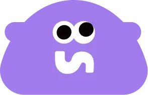
The brand starts from the idea of a personal universe. Every photo is a small star, and one person’s photos together make a constellation of their own. The mascot is an alien who visits that universe out of curiosity and records the moments people have in it. It stays beside you as a companion while you take your photos.
- Playful
- Naughty
- Youthful
- Goofy
- Alien
Concept
 +
 +
 =
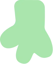
An alien hand, a camera and the letter S make the mark. The mascot is a curious visitor who records human moments.
Logo
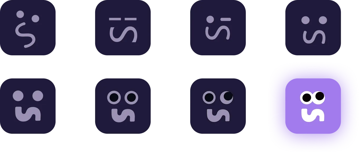
Seven sketches and the mark we kept. The S slowly becomes a face.
Logotype

Half circles and rounded corners keep the wordmark soft and playful.
Colour
- Main colour#A17BEC
- Colour 1#FFFFFF
- Colour 2#000000
A lavender main colour keeps the brand youthful and dreamy.
That is why the whole app is set at night. Every screen sits on the same dark sky with small fixed stars and a shooting star now and then. On top of it the main colour is used in a few lighter and darker steps, and each step has one job, so anything purple is something you can press or something you have chosen. Cards and buttons are panes of glass that glow, with no hard borders.
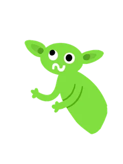
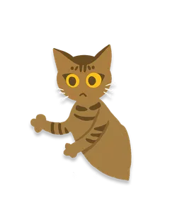
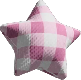
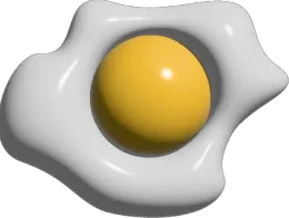
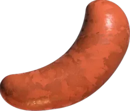
The characters carry the personality. Jeannie drew the purple mascot that waves at you on the home screen, a goblin and a cat, and a set of inflated objects such as an avocado and a fried egg that became the stickers.
Motion and touch are part of the look too. Things move on springs, so they overshoot a little and settle. The layout cards tick under your thumb like a dial as you swipe, and the countdown is a single large rounded number.

Listening to users
We built a feedback page into the app, so people can report a problem or make a wish at any time. We received requests to improve the iPad layout, wishes for new filters, and reports of trouble signing up. We wrote back to each person when their message came in, and we worked on what they had pointed to. A lot of small problems were fixed this way. I think it is one of the things we did well.
Results
- Downloads as of March 2026
- 2,400+
- Themes
- 206
- Stickers
- 266
- Languages
- 5
We promoted it on Instagram and Threads at the start. Jeannie and I were often logged in to the same accounts from two places at once, and I think that is why Meta flagged them. The accounts were suspended without an explanation and we lost that channel.
Looking back
Snapy started as a redesign of the photo booth. While we worked on it, it became a way for us to look at how people our age use photos to show who they are and to stay close to their friends.